
You still judge books by their covers because they’re powerful visual invitations. Stephen King’s covers grab your attention with dark hues and eerie imagery, setting the mood for thrilling narratives. They evoke emotion and create expectations, pulling you into his chilling worlds. The cover art plays with symbolism and typography, enhancing your emotional connection. It’s a crucial part of the storytelling experience, offering insights into the deeper themes within his works that you won’t want to miss.
The Allure of Book Covers: A Visual Invitation
Book covers are like gateways to new worlds, instantly drawing you in with their vibrant designs and intriguing imagery. They offer visual storytelling that captures the essence of a narrative before you even turn a page.
Each cover is an artistic interpretation, reflecting the themes, mood, and tone of the story within. You can’t help but feel a connection, as the colors and designs spark your imagination, hinting at the journey ahead.
Whether it’s a haunting image or a whimsical illustration, a well-crafted cover invites you to explore deeper. In the case of *Life of Pi*, the cover art encapsulates the novel’s exploration of spirituality and belief, enticing readers to delve into the profound themes within. So, next time you browse a shelf, remember that these covers are more than just protective layers—they’re your first glimpse into another dimension, waiting for you to plunge into.
The Role of Stephen King’s Covers in Setting Expectations
How do Stephen King’s covers shape your expectations before you plunge into his chilling tales? These striking visuals give you immediate genre cues, indicating you’re in for a gripping horror experience.
The artwork often hints at the eerie themes or psychological tension that await you, setting the tone right from the start. You might notice dark colors, unsettling imagery, or cryptic symbols that play on your fears, crafting cover expectations that align perfectly with the narrative inside.
King’s covers don’t just grab your attention; they prepare your mind for the twists and turns ahead. When you pick up one of his novels, you already sense the dread and suspense, making the reading experience even more compelling. Additionally, much like Agatha Christie’s intricate plots, King’s covers often foreshadow the complex narratives that await within.
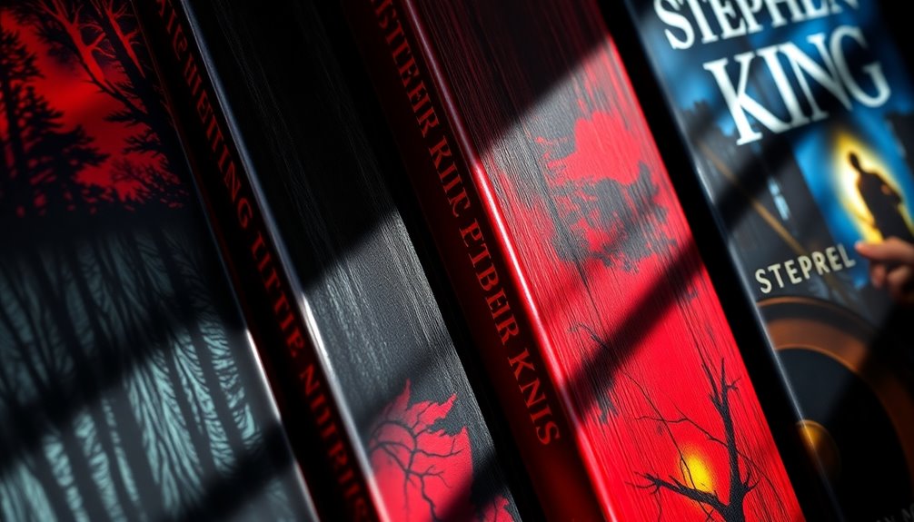
Iconic Imagery: What Makes King’s Cover Art Stand Out?
When you think of Stephen King’s cover art, distinctive color palettes immediately come to mind. These bold choices not only grab your attention but also set the tone for the story inside. Additionally, symbolic visual elements often hint at deeper themes, making each cover a visual puzzle waiting to be solved. Many of these covers also evoke the same sense of dystopian narratives that challenge societal values, reflecting the complex themes present in King’s storytelling.
Distinctive Color Palettes
Stephen King’s cover art captivates readers with its distinctive color palettes, instantly evoking a sense of intrigue and tension.
You’ll notice how color symbolism plays a vital role, enhancing emotional resonance and reflecting genre influence. Bold reds might suggest danger, while muted blues can evoke melancholy, guiding your expectations.
These choices align with current design trends, ensuring the covers remain relevant and appealing in a competitive market. The artistic interpretation is deliberate, creating a visual hierarchy that directs your gaze to key elements.
Additionally, the cultural context of each palette deepens your connection, making the art not just visually striking but also rich in meaning.
Ultimately, these distinctive colors elevate King’s covers, drawing you in before you even read a word.
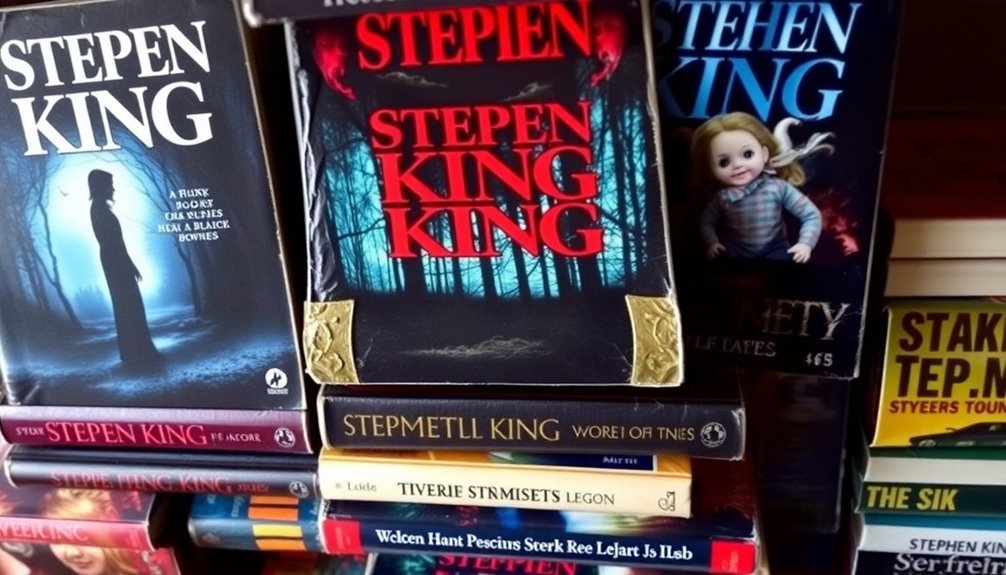
Symbolic Visual Elements
Imagery plays a pivotal role in making Stephen King’s cover art instantly recognizable and memorable. You’ll often find symbolic motifs that resonate deeply with the themes of his stories. For example, a haunted house or a shadowy figure can evoke the terror lurking within his narratives.
These visual metaphors not only capture the essence of the plot but also draw you in, sparking curiosity before you even flip the pages. King’s covers often utilize stark contrasts and eerie illustrations to represent the duality of human nature, making them both gripping and thought-provoking.
When you see a King novel, you’re not just looking at a cover; you’re experiencing a visual entry point into a world that’s thrilling and chilling at the same time.
Typography and Design: The Impact of Text on Perception
When you pick up a Stephen King book, the font choice instantly grabs your attention and sets the mood. The colors used can evoke feelings of dread or excitement, influencing how you perceive the story before you even read a word. Understanding these elements helps you appreciate the deeper impact of typography and design on your reading experience. This is similar to how Gothic themes enhance the atmosphere in works like *The Phantom of the Opera*, further influencing reader perception.
Font Choice Influence
Typography plays an essential role in shaping your perception of a book cover, influencing your feelings before you even crack open the pages. The choice of font taps into font psychology, evoking emotional cues that align with genre association.
For instance, a horror novel often features jagged typography styles, while romance might use elegant scripts. Staying in tune with design trends helps maintain branding consistency, ensuring that readers can easily identify an author’s work.
Effective visual hierarchy guides your eyes to the title, making it pop against the backdrop. Ultimately, the right font not only enhances reader perception but also sets the tone for the narrative, making your choice of typography vital in the overall design.
Color Psychology Effects
The colors on a book cover can evoke powerful emotions and set the mood long before you turn the first page. Understanding color psychology helps you grasp how authors and designers use it to influence perception.
Here are three key aspects to reflect upon:
- Color Associations: Different colors trigger specific emotions; for example, red often symbolizes passion or danger, while blue promotes calmness.
- Cultural Influences: Colors hold varied meanings across cultures, impacting how readers perceive the story’s themes.
- Visual Hierarchy: Effective use of color saturation and contrast guides your eye, enhancing brand recognition and emphasizing important elements.
Emotional Responses: How Do Covers Evoke Anticipation and Fear?
How do book covers manage to stir both anticipation and fear in readers? They use powerful visual storytelling elements that resonate emotionally.
Anticipation triggers often lie in striking colors or intriguing imagery, drawing you in and sparking curiosity. In contrast, fear representation can be found in dark, unsettling visuals that hint at the story’s tension.
This cover symbolism creates a psychological impact, making you feel the weight of what’s to come. When you see a Stephen King cover, for instance, the interplay of these elements evokes a thrilling sense of dread and excitement. Just as in The Book Thief, where the power of storytelling shapes the characters’ emotional journeys, covers can similarly set the tone for what lies ahead.
Ultimately, this emotional resonance guarantees that the cover isn’t just a wrapper; it’s a gateway into a world where fear and anticipation collide.
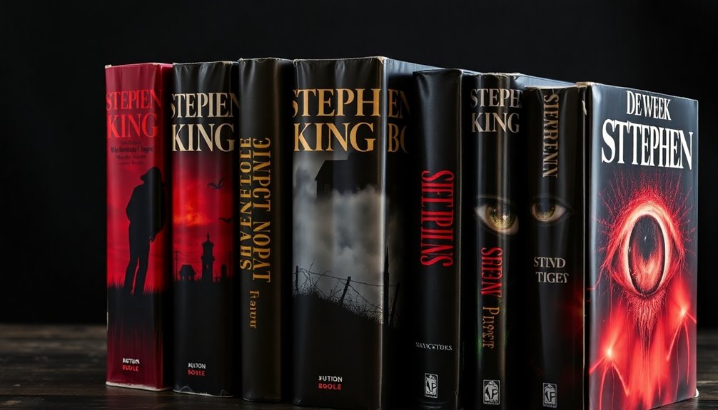
The Evolution of Stephen King’s Cover Art Over Time
As you explore the evolution of Stephen King’s cover art, you’ll notice how it mirrors the changing landscape of horror literature itself. His cover design has undergone significant artistic evolution influenced by genre trends and reader perceptions.
Here are three notable shifts:
- Initial Simplicity: Early covers focused on stark imagery, capturing the raw essence of horror.
- Cultural Symbolism: Later designs incorporated deeper themes, reflecting societal fears and iconic adaptations.
- Visual Storytelling: Modern covers embrace intricate illustrations, enhancing the narrative’s emotional weight and aligning with new marketing strategies.
These shifts reveal how cover art not only draws readers in but also shapes their expectations, making it a crucial part of King’s literary legacy. This evolution parallels the exploration of moral ambiguity seen in works like *The Goldfinch*, emphasizing the complexities of human nature in both horror and literary fiction.
Beyond the Cover: How Does Art Complement King’s Narrative Depth?
Cover art in Stephen King’s works not only attracts attention but also deepens your understanding of his complex narratives. The striking visuals often create narrative synergy, drawing you into the story before you even turn a page.
Each illustration serves as an artistic interpretation of King’s themes, enhancing the emotional weight you experience. You’ll find that the art captures thematic resonance, echoing the fears and conflicts within the text.
This visual storytelling invites you to explore deeper meanings and connects you to the characters’ struggles. As you analyze the cover, you’ll find it enriches your reading experience, making King’s chilling tales even more impactful.
In this way, the art becomes an integral part of the narrative journey.
Conclusion
In the world of Stephen King, the cover isn’t just a façade; it’s a portal to the dark, twisting tales within. Like a haunted house beckoning you inside, each cover invites you to confront your fears and explore the unknown. So, next time you pick up a book, remember: that striking image isn’t just decoration—it’s a promise of the thrilling journey ahead. Embrace the allure, and let the pages whisper their secrets to you.